Typography at the center of my practice with 3+ years of experience in branding and advertising, I create tailored look and feel in consumer-facing environment through Type, Art Direction and Motion Design for brands in Lifestyle, Culture, Tech, Retail. A recent graduate from Rhode Island School of Design with a BFA in Graphic Design. Currently open to full-time position and freelance opportunities.
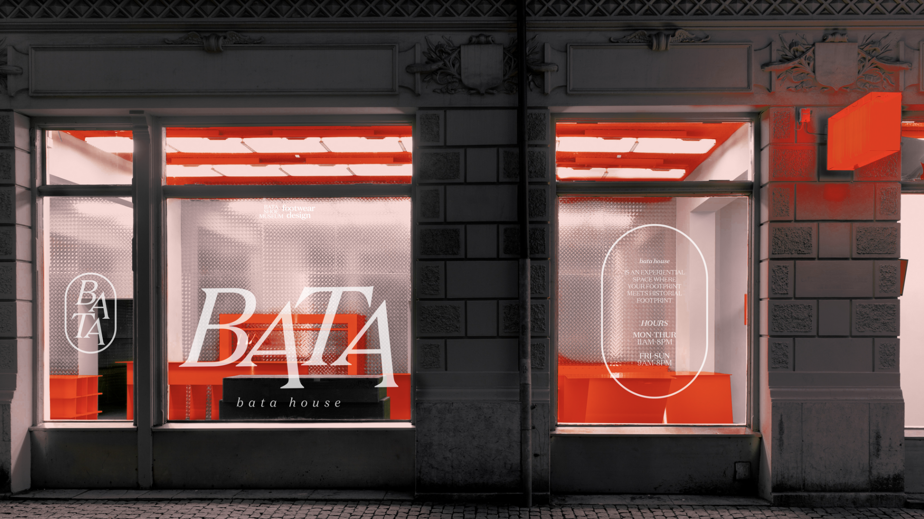
Speculative identity for Bata Shoe Museum in Toronto, Ontario. The original museum has a focus on shoe-making history, this project has a contemporary twist on the original look and feel, repositioning shoe as an apparel object and bringing in pop up store as part of the marketing strategy. The new identity continues with the red from the original logo with same hue but a brighter one, and a change into a serif typeface, Domaine Text by Klim Type Foundry, for an elegant feel but also speaks more to fashion industry.
Dear Pink is a campaign dedicated to educating the public about the Pink Tax phenomenon and advocating for its elimination to combat market and cultural disparities. Pink Tax is the theory that products marketed toward women cost more than nearly identical products targeted toward men.
Typeface In Use: Riforma by Lineto
Typeface In Use: Riforma by Lineto
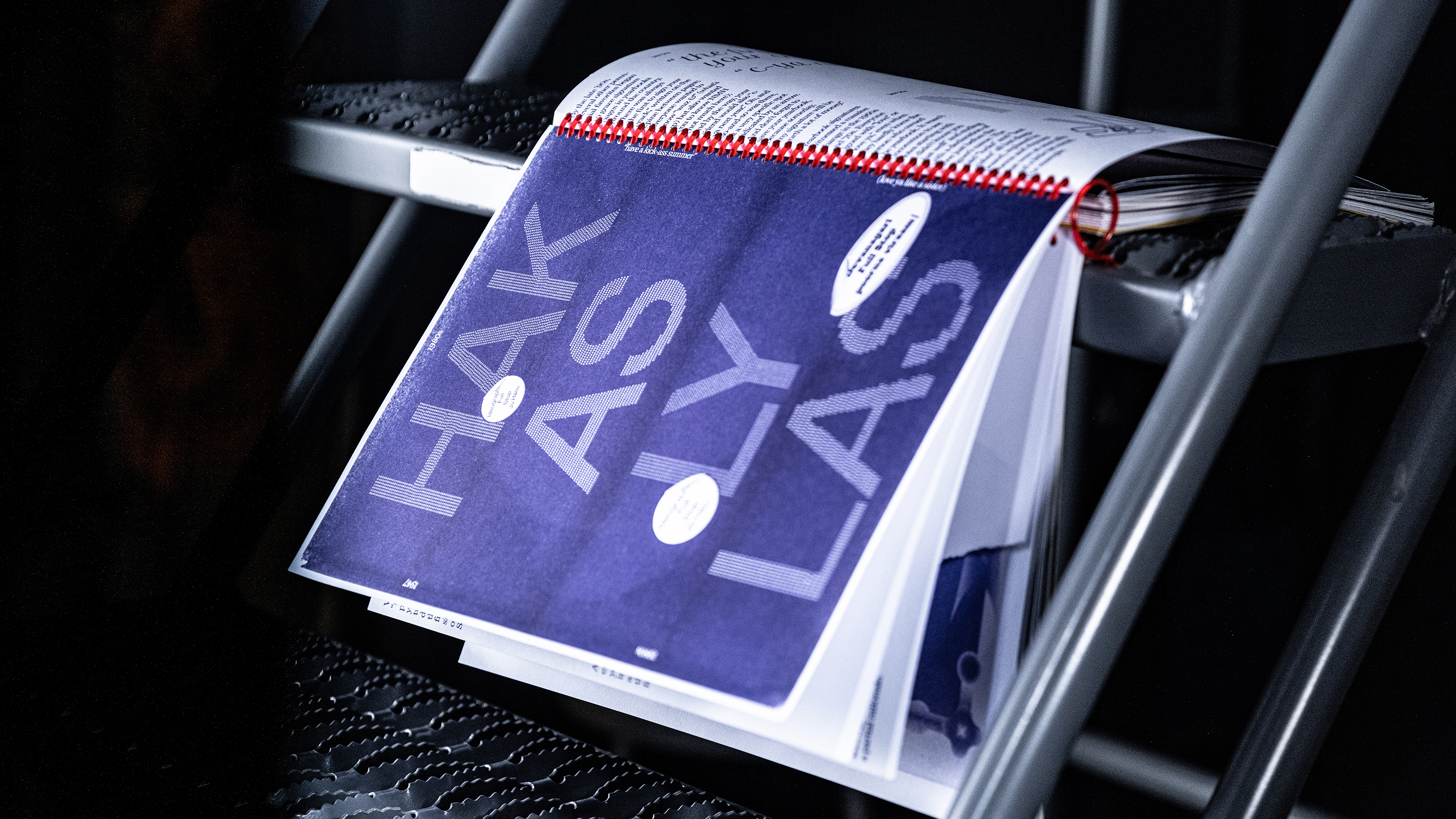
A speculative yearbook typeset in full stops coming from four different languages. Sourced from Jennifer Billock’s “Why Do People Sign Yearbooks?”, this micro publication introduces how yearbook signatures evolve over years ever since the birth of first yearbook back in 1914 at East St. Louis High. Earlier ones are mostly hand-written, sourced from poems and scrapbooks; later they are largely replaced by acronyms inspired by text messages. Back cover with initials of everyone in the class designed with ideographic full stops. Miller Text Roman, Helvetica Now, Petit Formal Script in use.
A business problem exists, IBM puts technology at the core to solve it, to change it for the better.
Through the lens of the smarter business brand platform, we can think about IBM’s central value proposition as intelligent transformation.
Smarter business isn’t about what IBM makes, it’s about what IBM makes possible.
Through the lens of the smarter business brand platform, we can think about IBM’s central value proposition as intelligent transformation.
Smarter business isn’t about what IBM makes, it’s about what IBM makes possible.